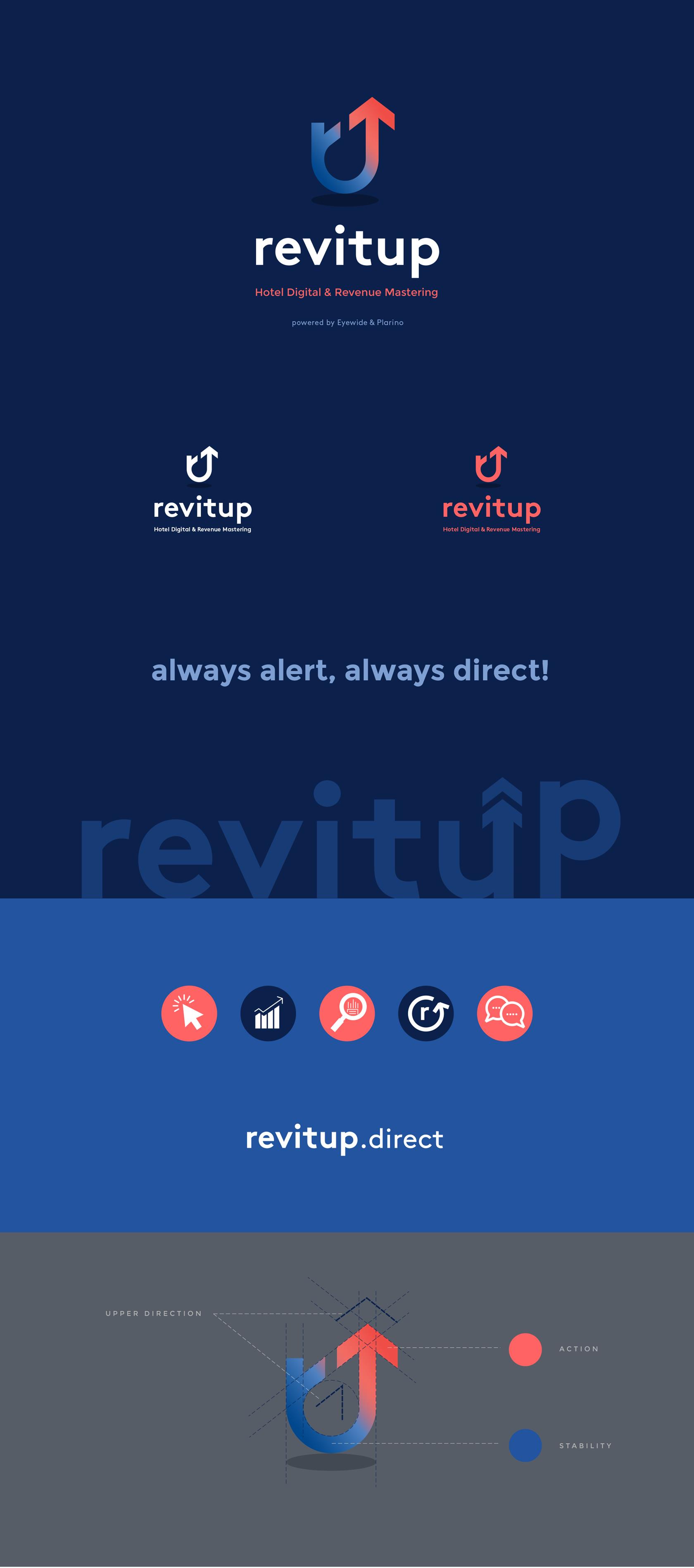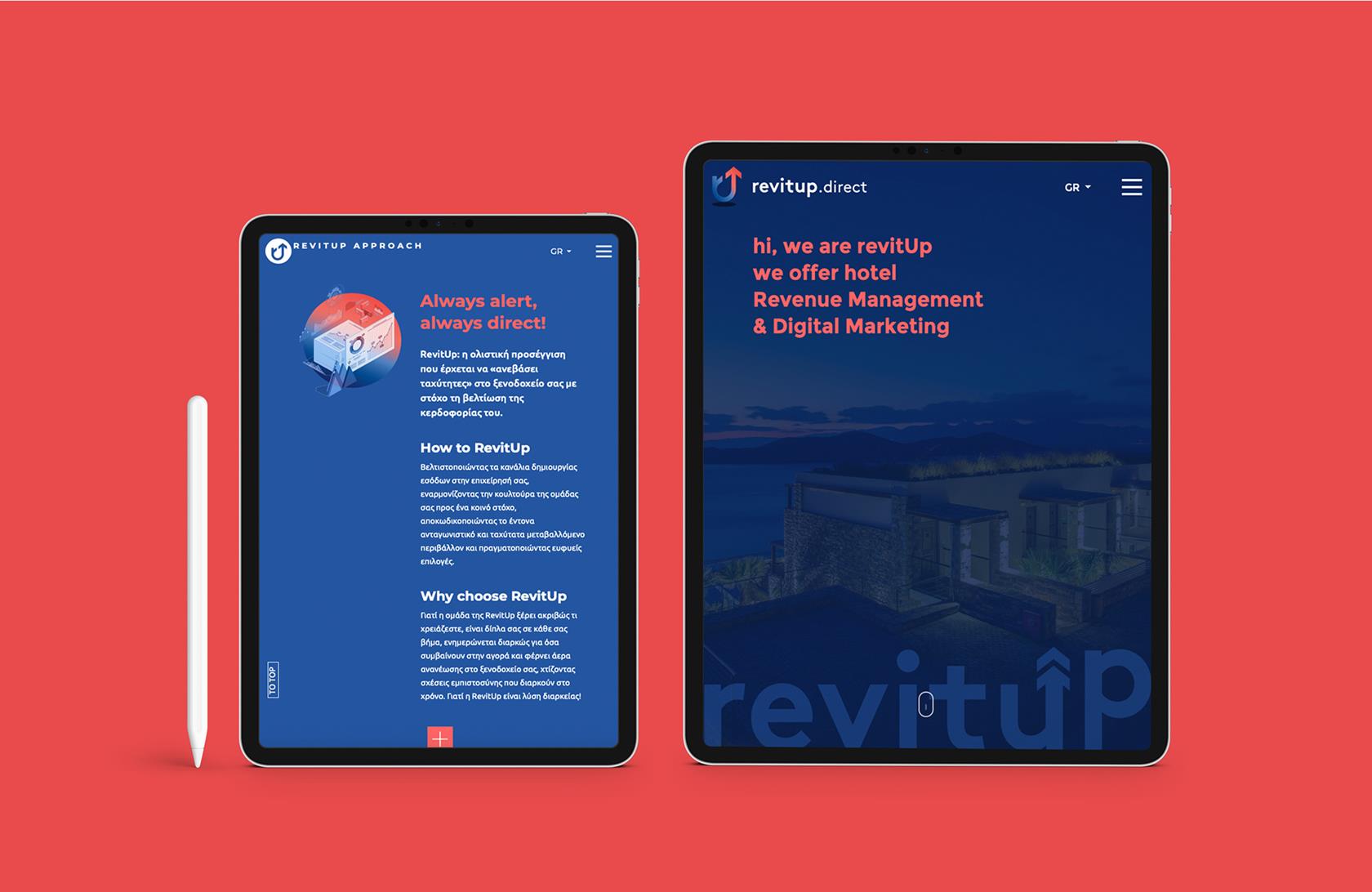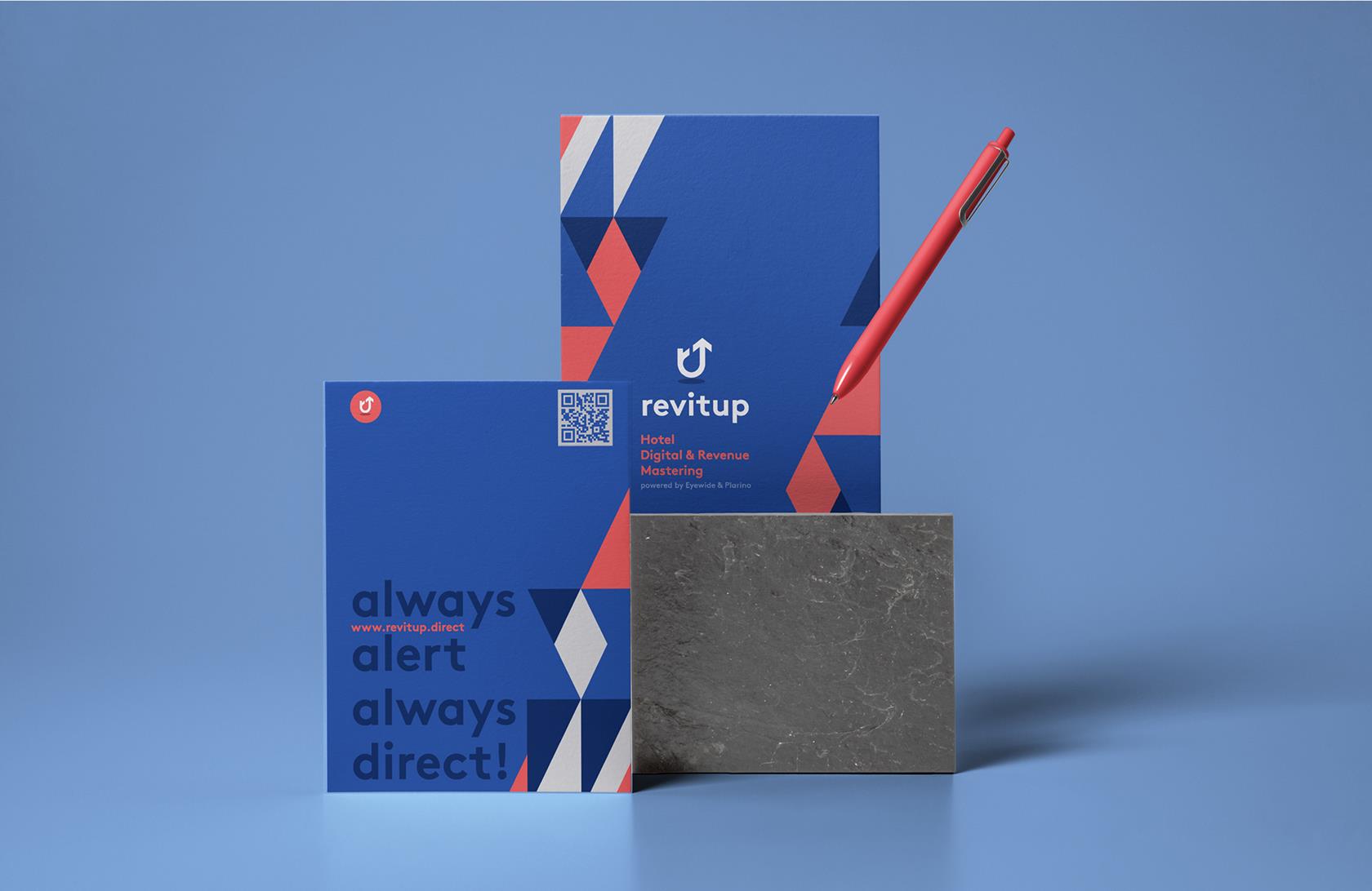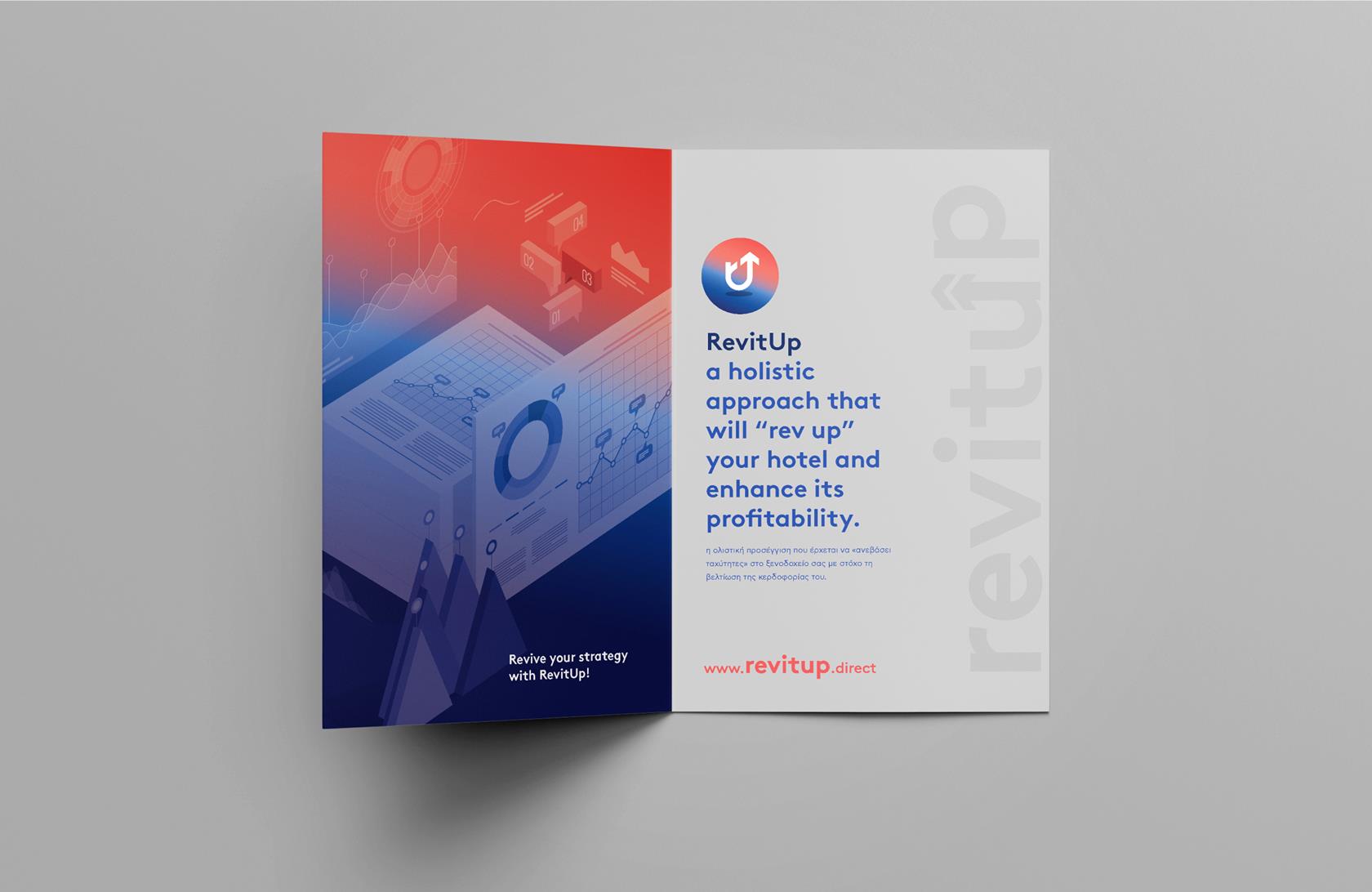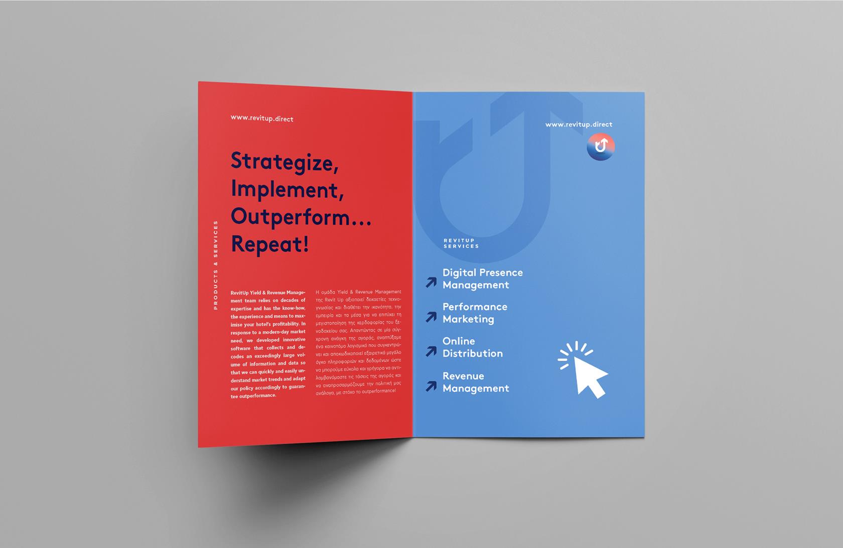
REVITUP BRANDING
Corporate identity and promotional copywriting for a specialized holistic digital marketing and sales service for the hospitality market. The identity was built around the culture of the name that communicates to be alert and proceed dynamically. The color palette represents the two values that the service stands for, stability and reliability, on the basis of its structure, resulting in action and efficiency.